CHECKLIST
Orby AI
Streamlining financial workflows with intelligent document AI solutions
SaaS
B2B
Document AI
Scroll down to explore
My role
UX/UI Design, UX Research
TEAM
TARGET AUDIENCE
Large to medium enterprise financial teams that handle document-intensive workflows
TIMELINE
Feb - Apr 2023


The Opportunity
BACKGROUND
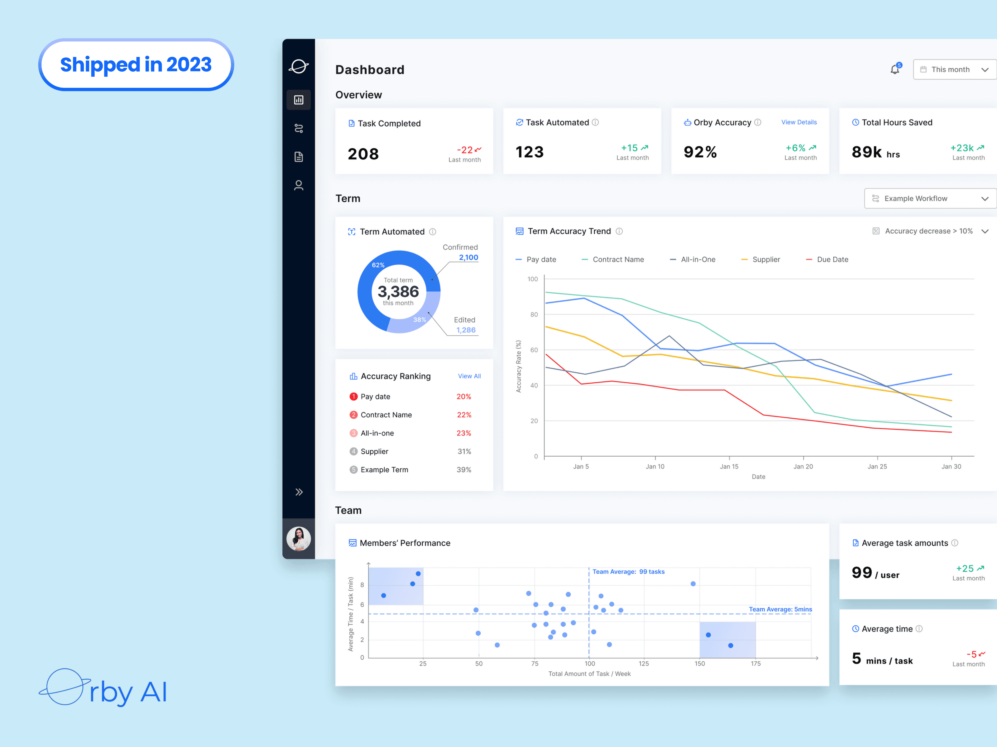
Orby AI is a web-based tool that simplifies document workflows for enterprise financial teams, reducing contract processing time dramatically.
WHY IS IT IMPORTANT?
Without clear visual insights, financial teams lack confidence in performance gains such as accuracy, time saved, and productivity.
WHAT WE DO
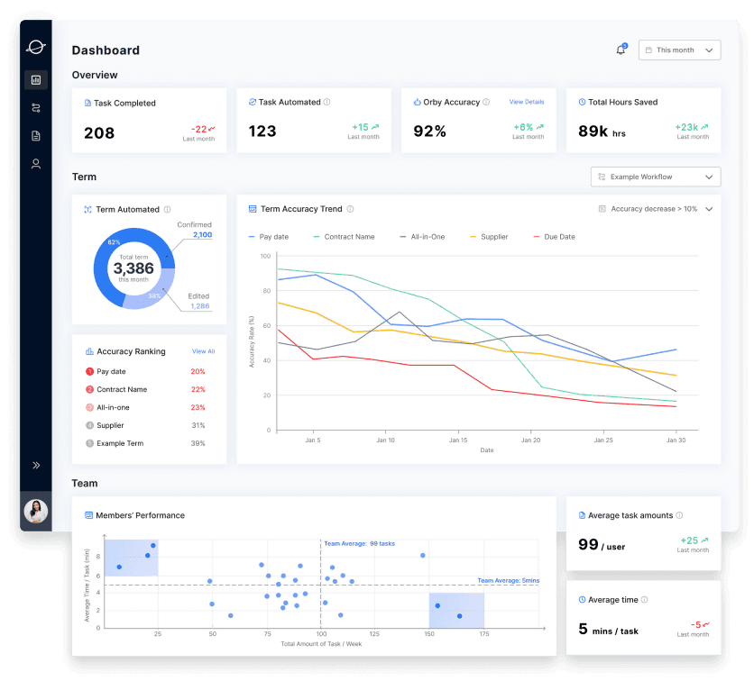
We design dashboards integrated into workflows, enhancing data transparency and enabling financial teams to troubleshoot effectively.
Impact
MY ROLE
As the product designer, I dived into processing AI and financial team workflow domain knowledge, defining user interaction with dashboard and key metrics visualization.
IMPROVEMENT
We delivered a 0-1 dashboard product tailored for financial teams in 8 weeks. This dashboard significantly boosted user confidence, contributing to the successful funding of $34.5M in total, and partnerships with Uber and Google.
115min
Document Processing Time
60%
Document Processing Accuracy
The Challenge we have...
How might we help the financial team to enhance their work efficiency?
Our Solution
Financial Operation Specialist
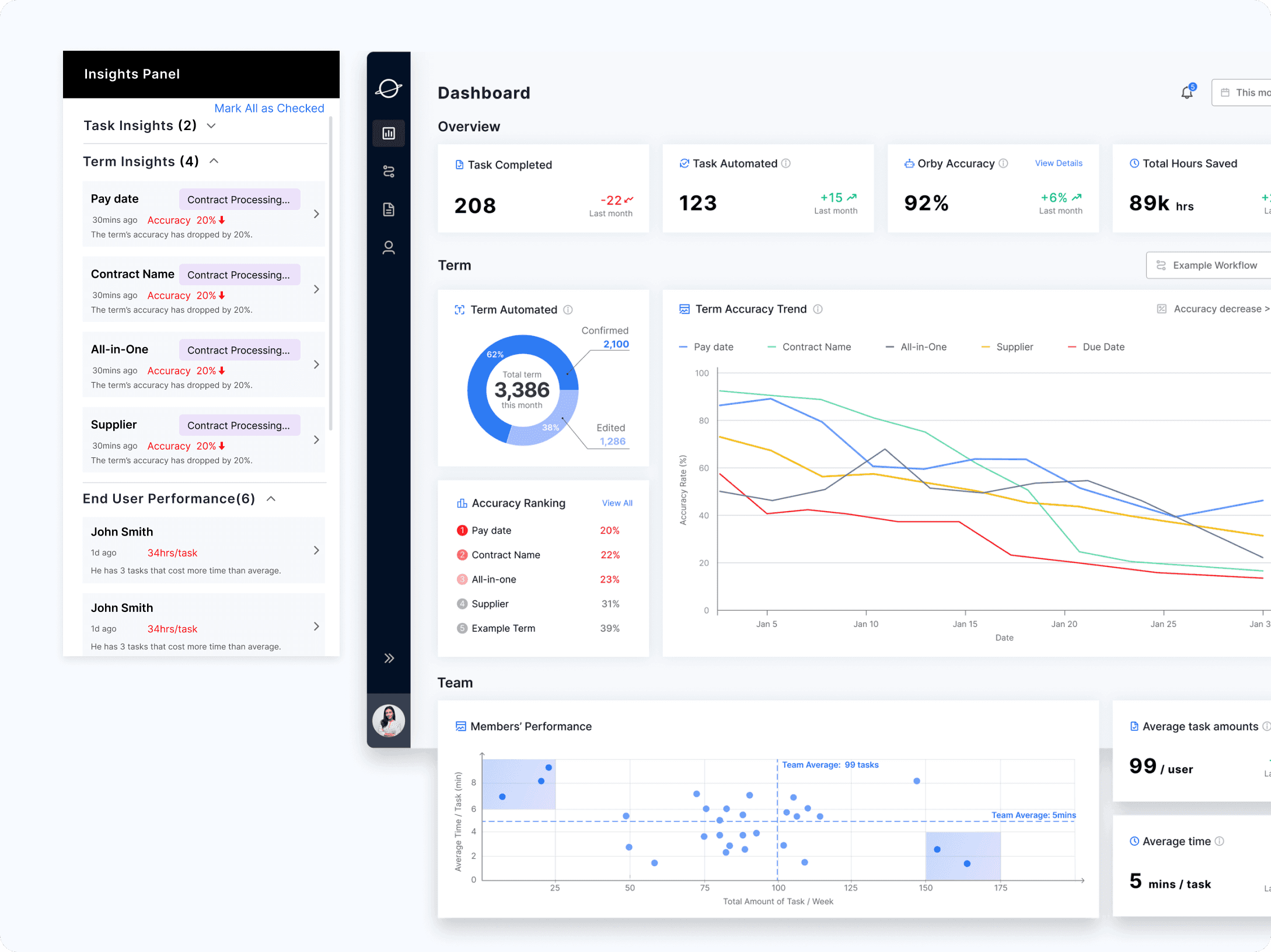
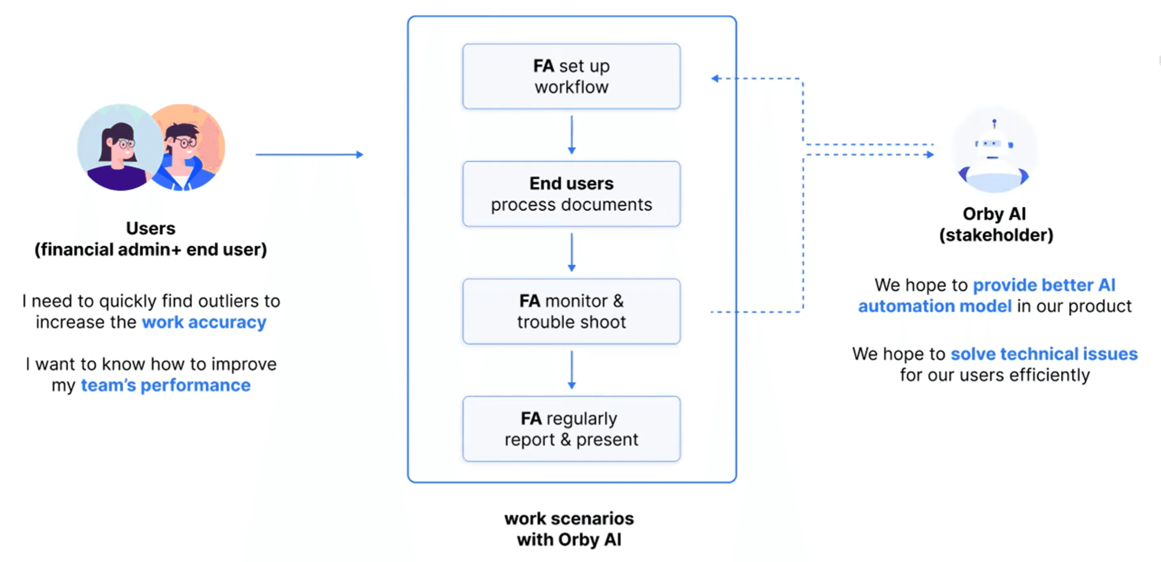
During their daily work, they review notifications to assess Orby's term accuracy, identify outliers, analyze related tasks, and derive valuable insights to improve decision-making.
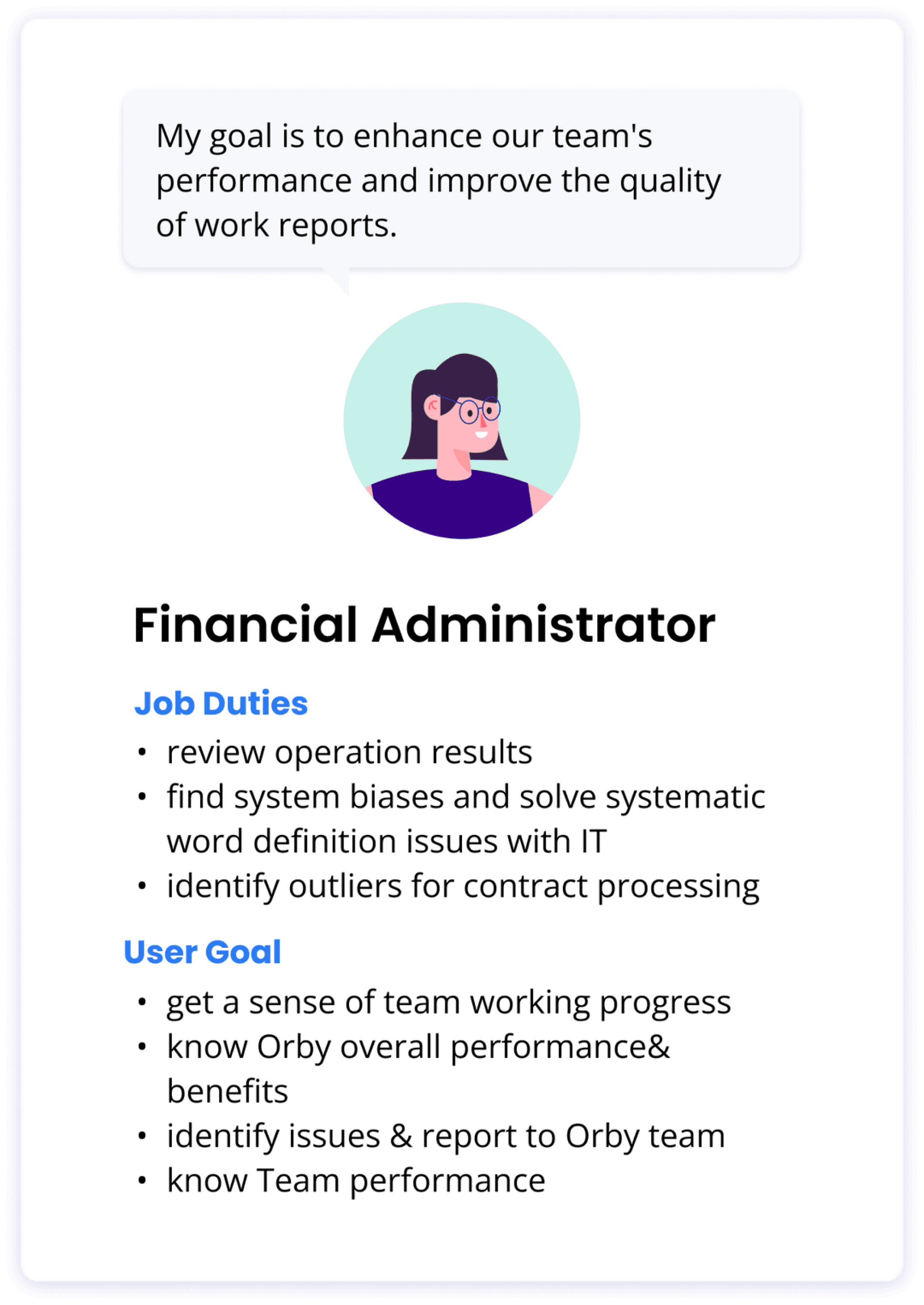
Financial Administrator
Their main goals are to deliver concise work summaries, manage team performance, and detect potential outliers. They primarily use the overview section to produce reports and monitor team efficiency effectively.

-1
How Did I Get To The Design Solutions
Stakeholder Interview
Clarify business scope & Sync client interview feedbacks
Understand work routines and user goal of different users
Pinpoint essential troubleshooting data during work monitor
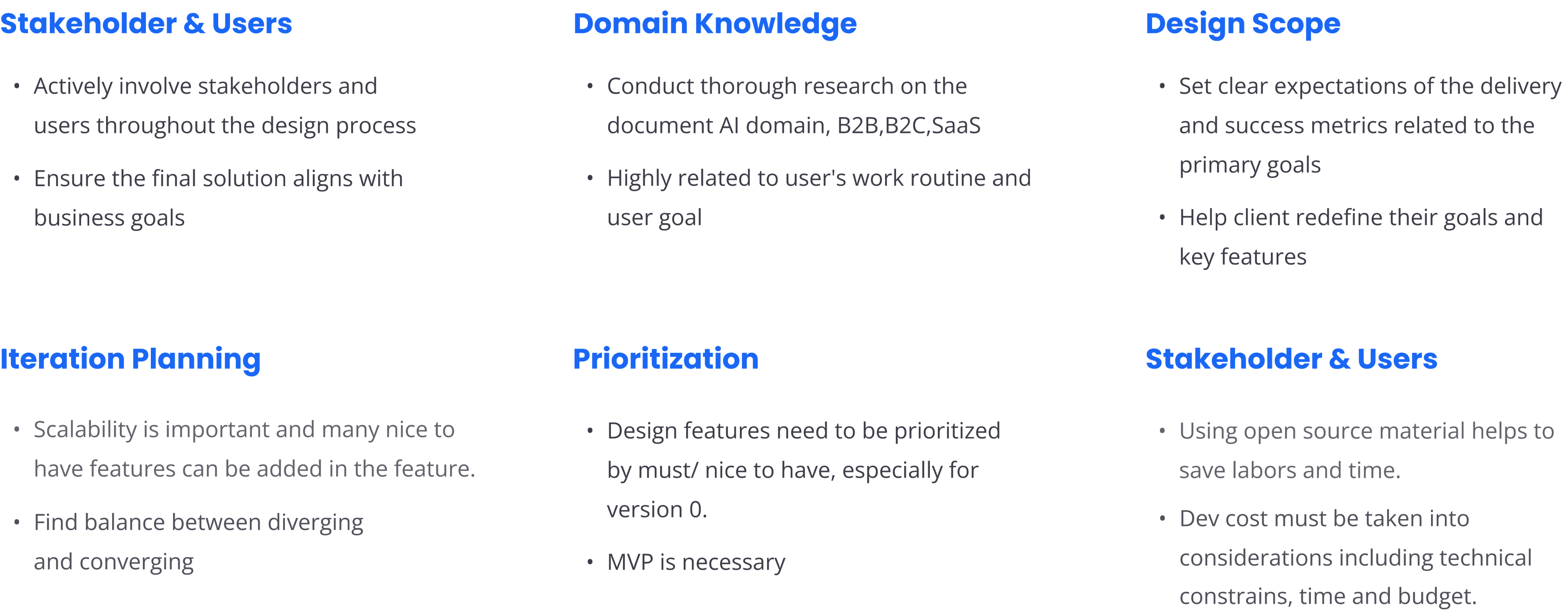
Define design scope and client consideration
What We Learn From...
Complex Domain Knowledge in Document AI &. Financial Team Workflow
As new to this type of SaaS product, I need to quickly fill gaps in my expertise.
To address this, I conducted competitive research on similar competitors studying the dashboards of these similar products, summarizing how they visualize key information, provide alert system, and offer insights.

01
Alert System
A great dashboard design blends explanations and exploration, with alerts and insights to help users make smart decisions at work.
02
Key Metrics Summary
Summarizing metrics helps users quickly understand what to monitor without getting overwhelmed by excessive data.
03
Data Visualization
The design should be simple and efficient, using effective data visuals for easy information access and user interaction.
Meet Main Users
The two primary personas have distinct perspectives when analyzing data, allowing them to enhance their decision-making capabilities in their respective work routines.

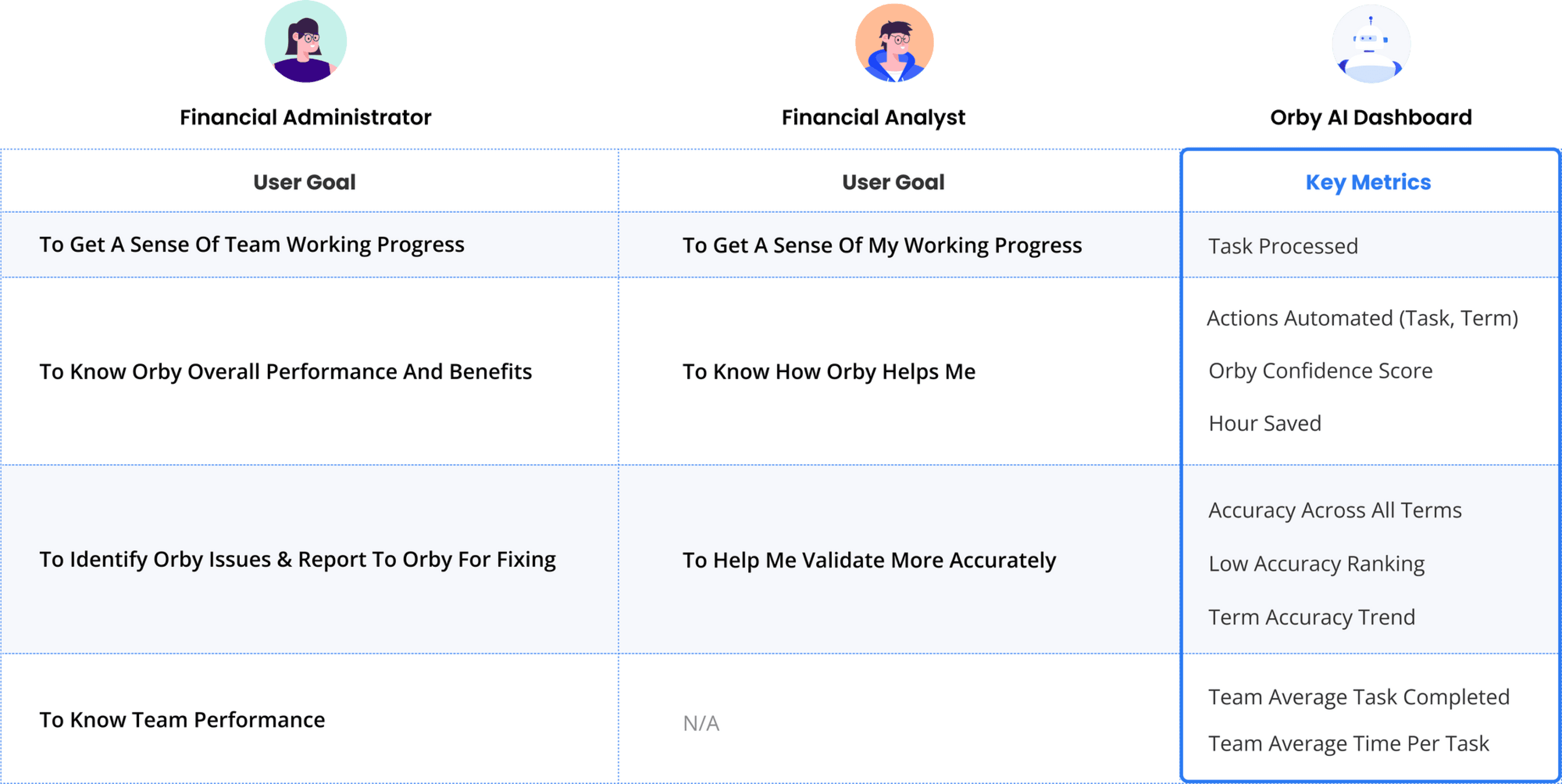
User Goal &. Key Metrics
We have identified a comprehensive list of metrics that cater to the user goals of two main types of users, allowing them to gain valuable insights into the performance of the Document AI system. These insights enable informed decision-making, workflow optimization, and ultimately lead to higher productivity and success in their daily work routines.
Design Exploration
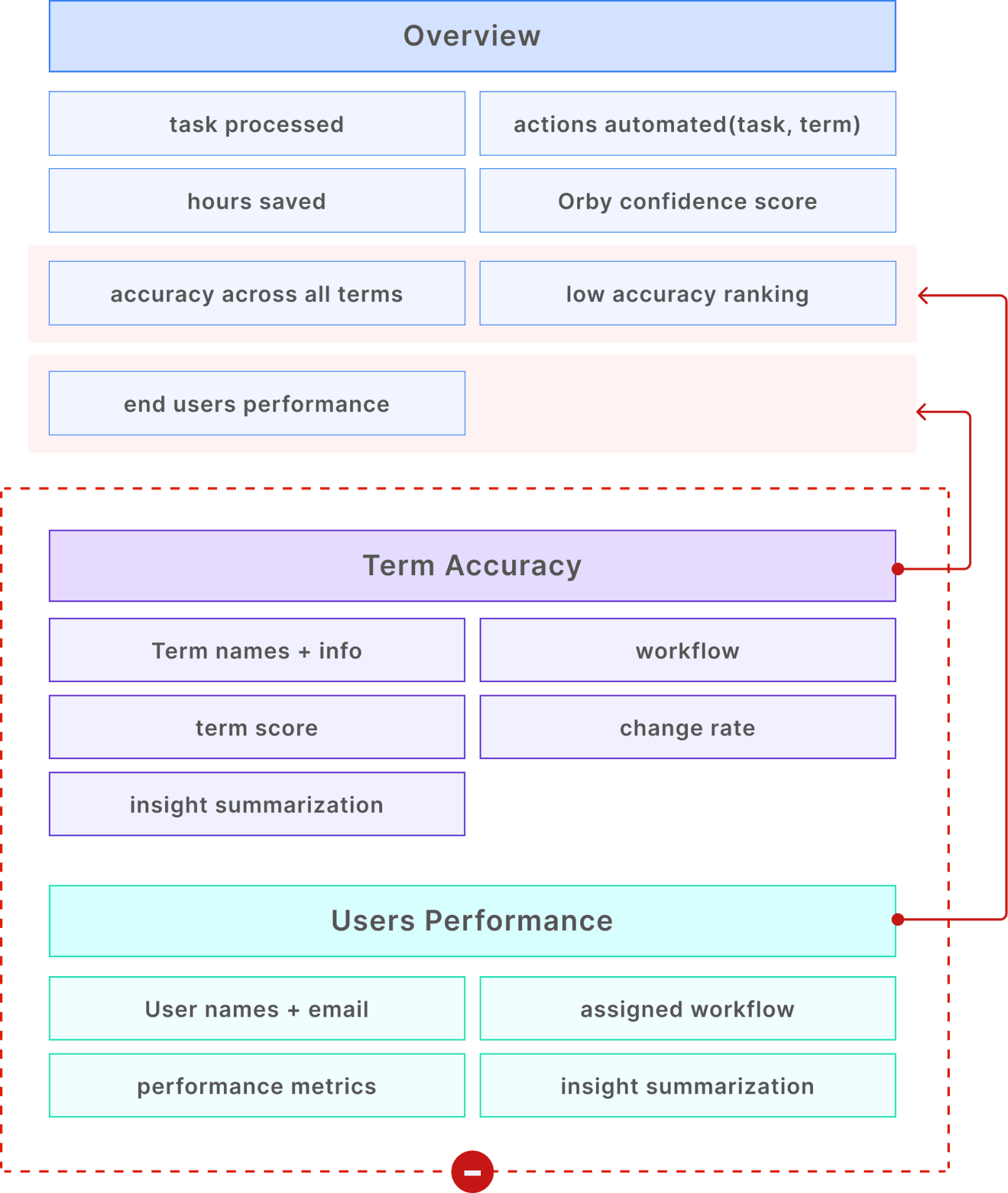
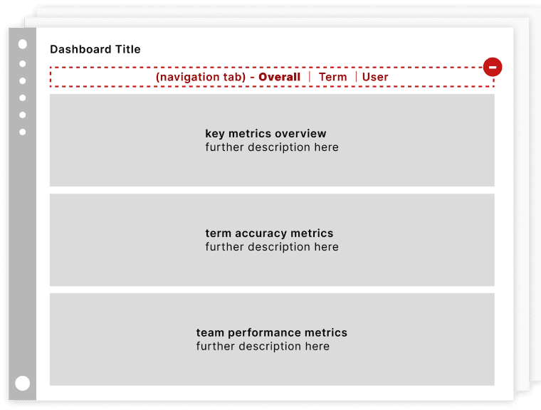
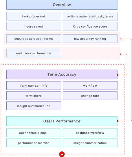
Overview: More efficient dashboard structure by eliminating navigation bar
In the first iteration, we abandon the initial concept of a navigation tab design in order to limit redirection and reduce development difficulty.
SIMPLIFIED
BEFORE

01
Iteration 01: Simplify Key Metrics
Get info at a glance
Show less but needed enough data to reduce cognitive load
Limit use of graphic to reduce the difficulty in development
BEFORE

AFTER

02
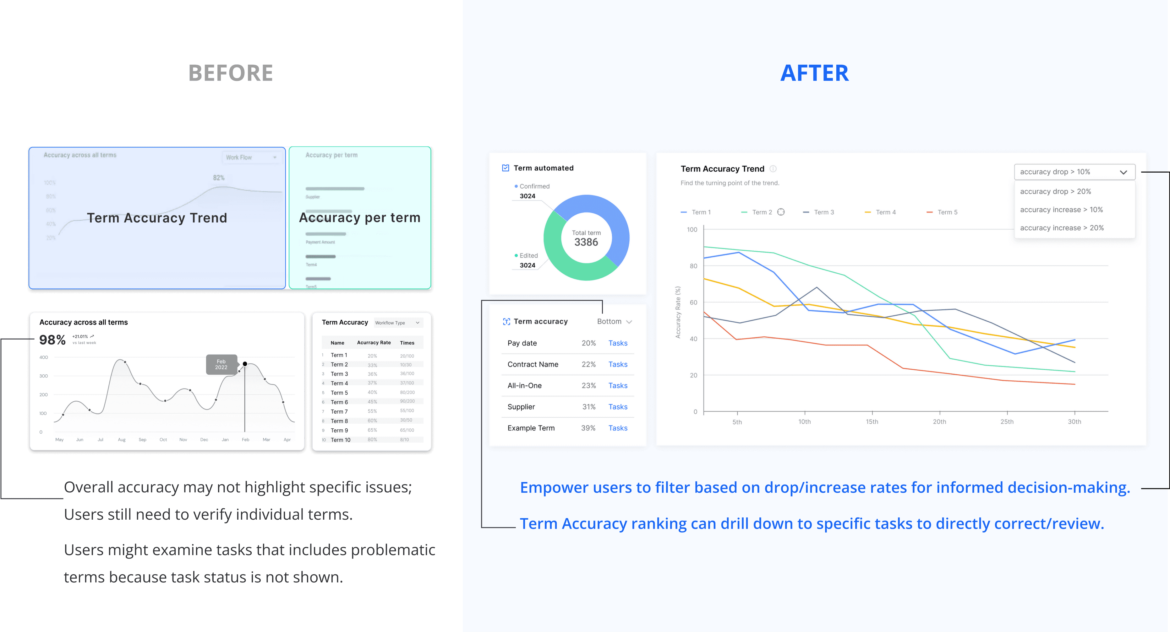
Iteration 02: Term Accuracy
To assist users in narrowing down specific term outliers, the identified conditions are :
When accuracy changes dramatically OR when the accuracy rate is extremely low or high.
03
Iteration 03: Term Performance
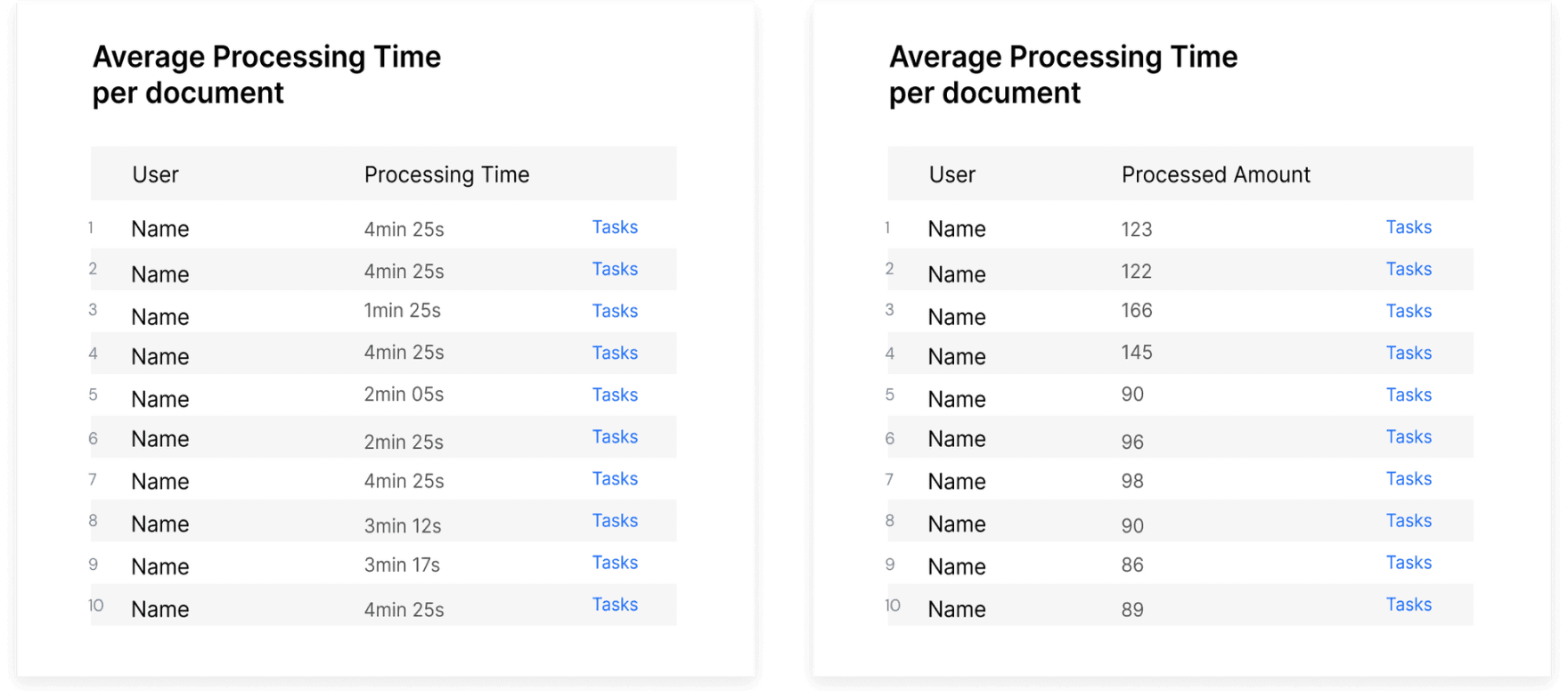
01
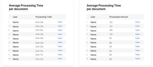
2 separate tables
02
Line Chart + Bar Chart
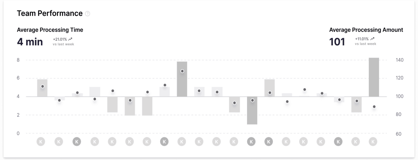
Cons:
Readability issue when cross-checking two charts.
The horizontal axis lacks sufficient scalability to
accommodate a large number of users.
WINNER
03
2 Axis Scatter Chart

Utilize a dual-axis approach to represent two dimensions of performance metrics in a
relative manner.
To maintain chart comprehensibility, associate each point with a team member to
avoid overcrowding.
Highlight the problematic areas.
04
Iteration 04: Alert System
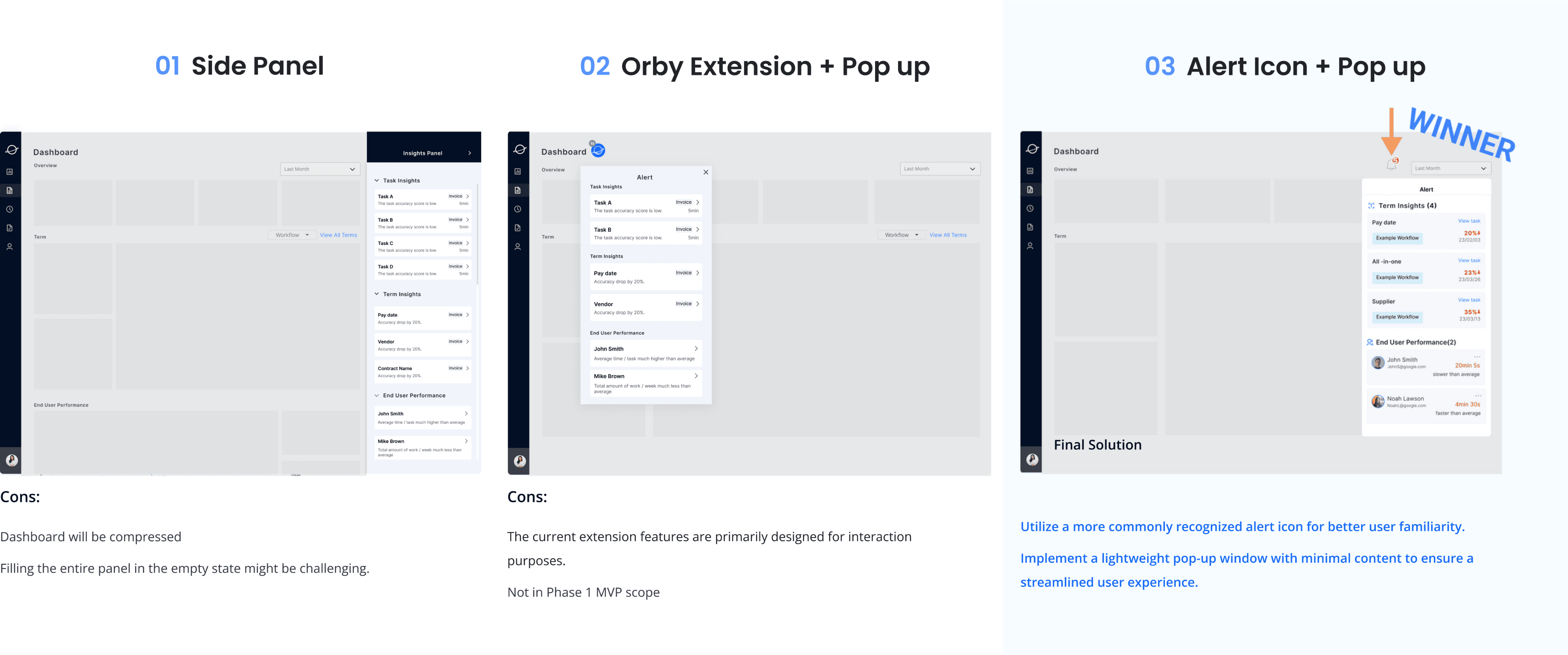
Final Design
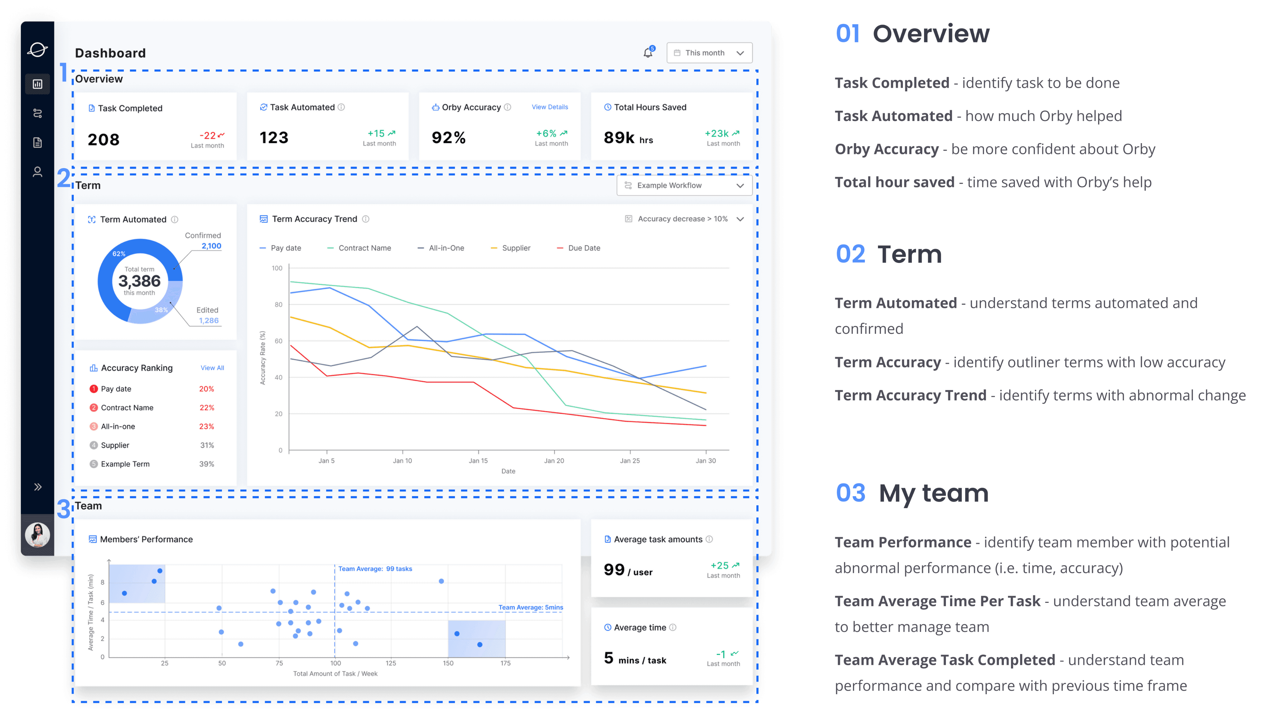
Final Design - A Successful Launch
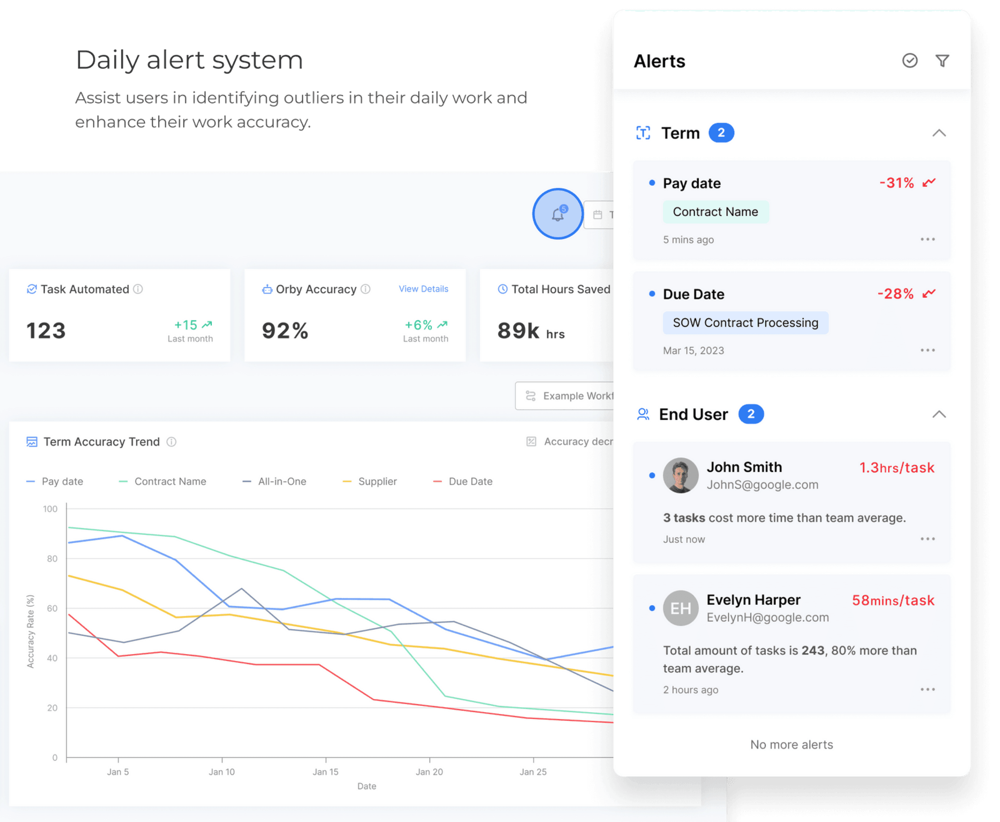
Feature 01
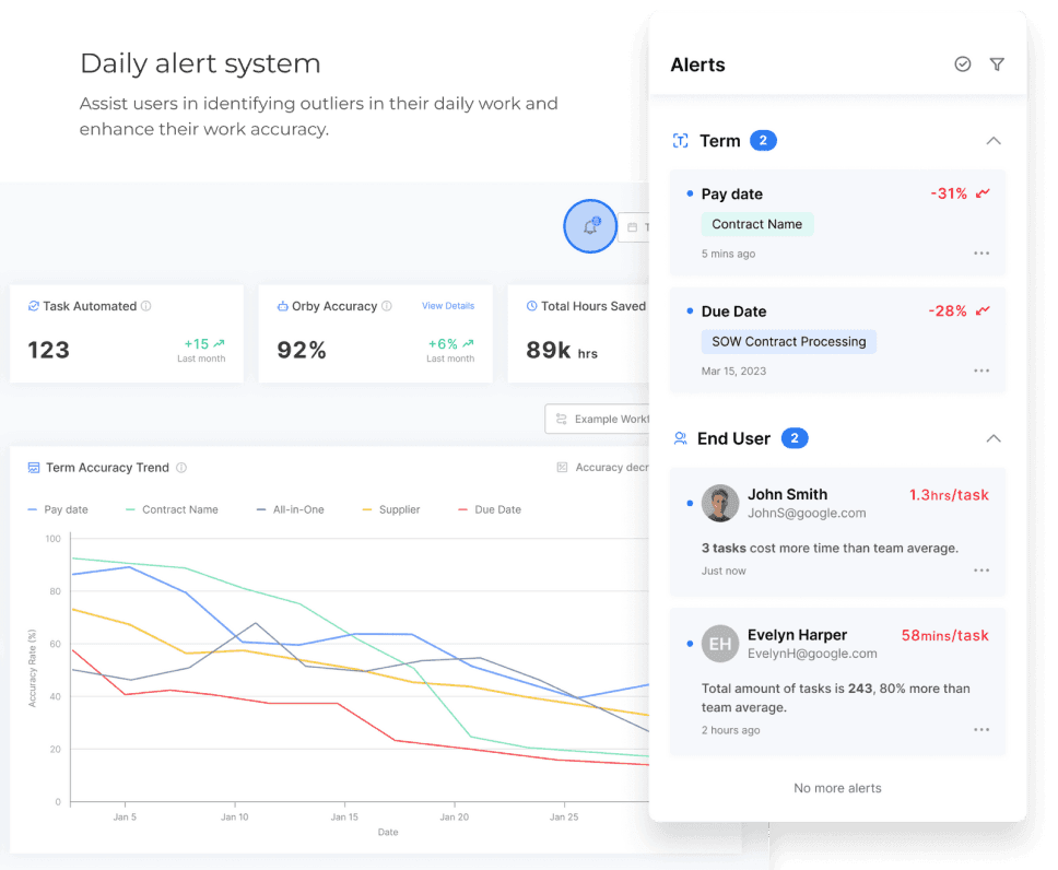
Daily Alert System
USER GOAL 01
Detect and effectively handle any outliers in
the workflow
Increase work accuracy
SOLUTION
Feature panels tailored to the workflow and
provide clear indications of outliers and
actionable insights
Prompt users to take appropriate actions that
improve work quality and productivity
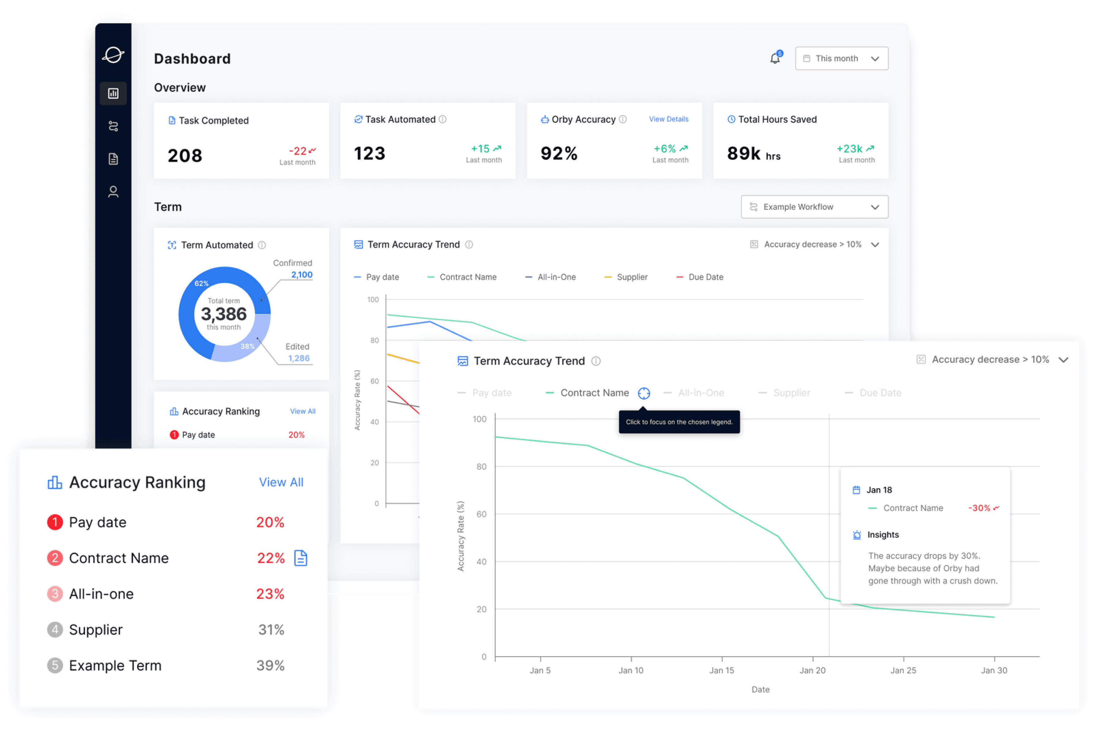
Feature 02
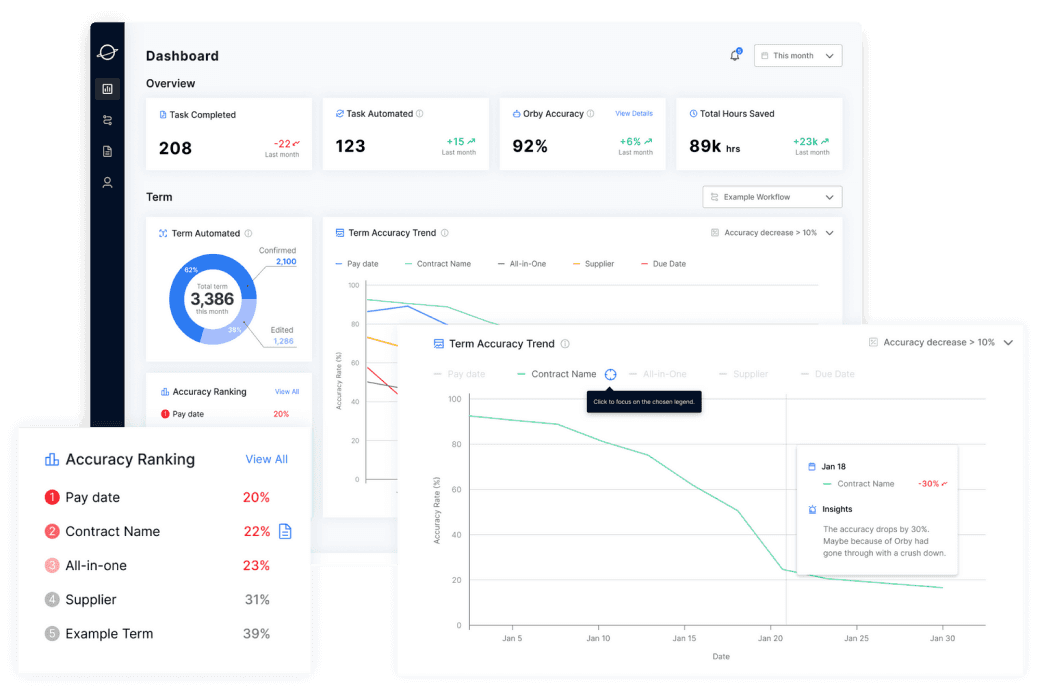
AI Performance Monitoring
System
USER GOAL 02
Monitor AI model performance over time
Identify outliers
SOLUTION
Track term abstracting performance of the AI
model overtime and monitor model output
accuracy
provide insight for potential reasons and help
users diagnose and address issues effectively
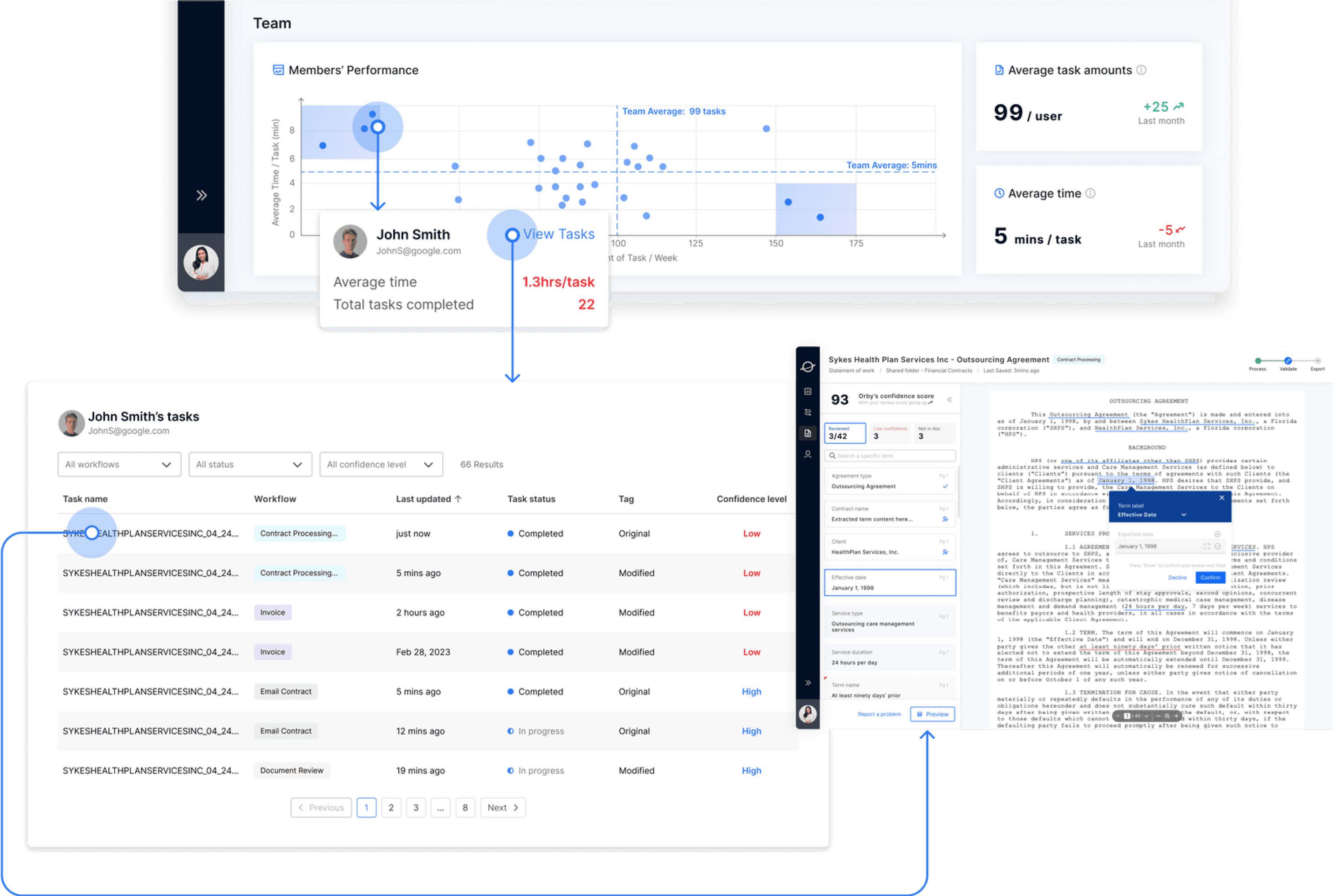
Feature 03
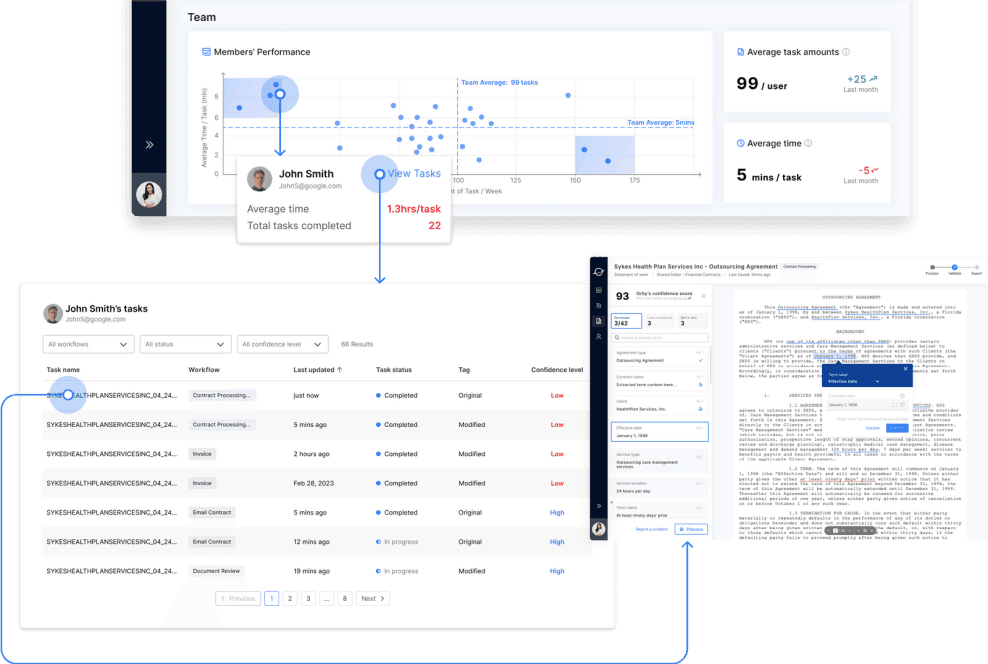
Team Performance
Tracking System
USER GOAL 03
Monitor team performance
Identify outliers in the team
SOLUTION
Allow administrators to monitor and track the team performance indicators, such as average task amounts and average time and identify outliers
Check outlier’s task table to further
investigate into the tasks and associated
documents
Reflection
Future Steps
More customized dashboard for different users:

More to explore
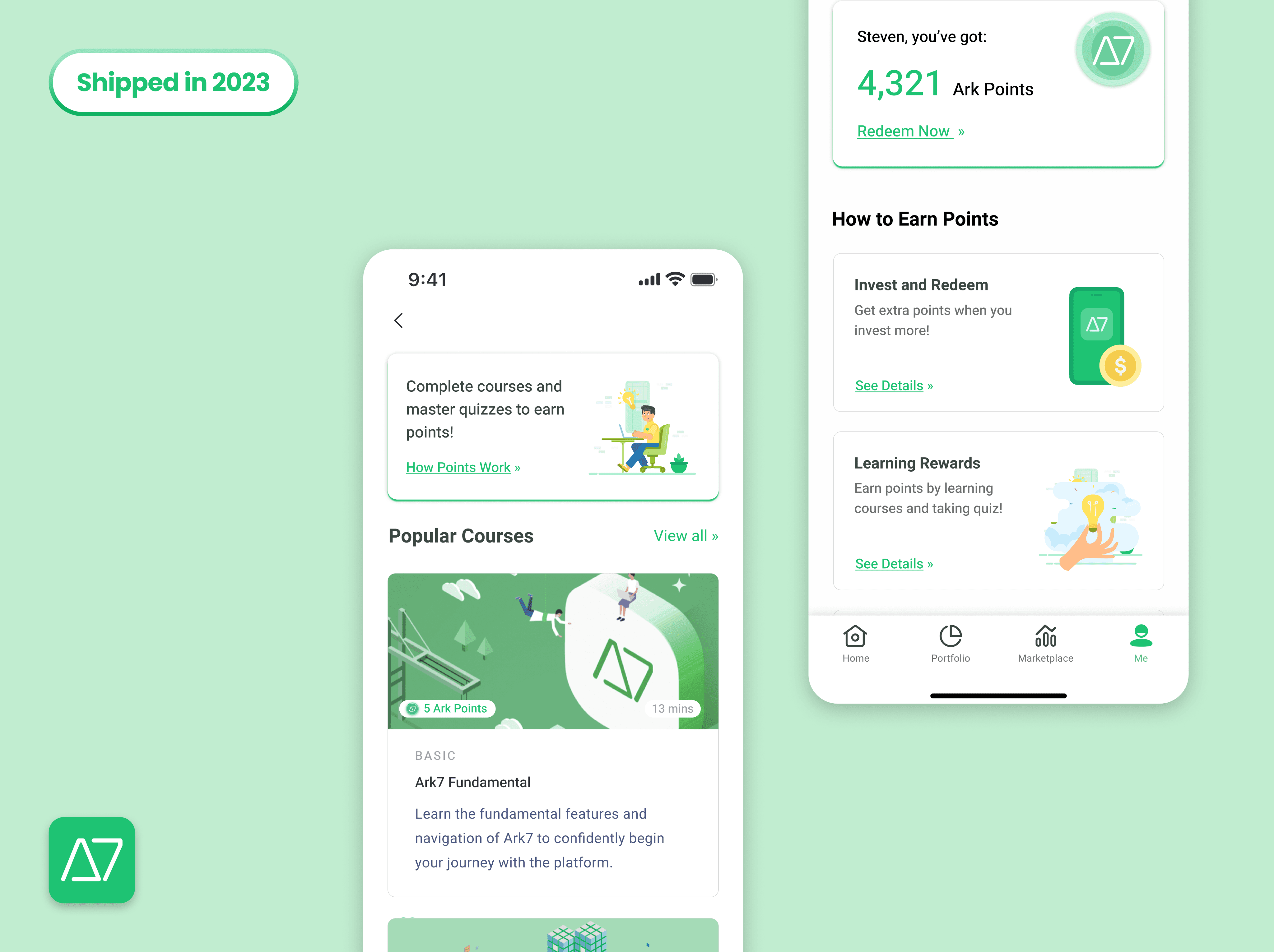
Mobile Application Design | Fintech
Ark7 Learn and Reward System
Design end-to-end learning and rewards system to enhance user engagement and order completion rate
Read Case Study
B2C
+53% Order Completion Rate
Web Application Design | SaaS
Orby AI Process Dashboard Redesign
Redesign Saas Process Automation Dashboard to improve operational efficiency and task completion rate
Read Case Study
B2B
Document AI
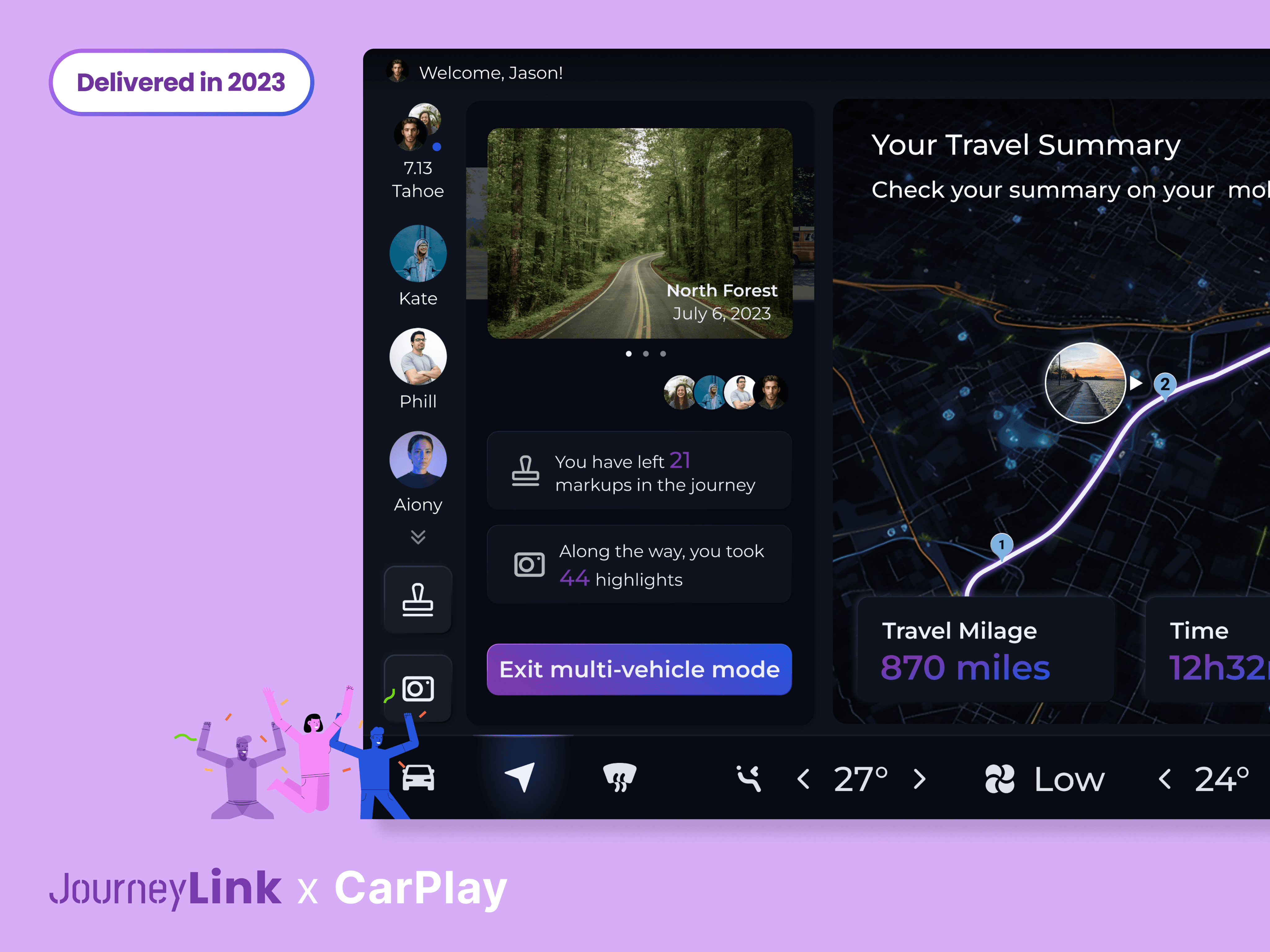
Carplay Application Design | HMI
JourneyLink V2V Carplay System
A HMI system that forging seamless connections among long-distance multi-vehicle roadtrips
Read Case Study
HMI
80% task success rate
Let's Connect!
Feel free to get in touch with me here ↓
jenniferzeng5562@gmail.com
Instagram →
Crafted with love

by Jennifer Zeng in New York City © 2024
Orby AI
Streamlining financial workflows with intelligent document AI solutions
Scroll down to explore


My role
UX/UI Design, UX Research
TEAM


TARGET AUDIENCE
Large to medium enterprise financial teams that handle document-intensive workflows
TIMELINE
Feb - Apr 2023
The Opportunity
BACKGROUND
Orby AI is a web-based tool that simplifies document workflows for enterprise financial teams, reducing contract processing time dramatically.
WHY IS IT IMPORTANT?
Without clear visual insights, financial teams lack confidence in performance gains such as accuracy, time saved, and productivity.
WHAT WE DO
We design dashboards integrated into workflows, enhancing data transparency and enabling financial teams to troubleshoot effectively.
Impact
My Role
As the Product Designer responsible for the design of Ark7's rewards and learning features from 0-1, I observed a significant rise in user engagement and investment.
Improvement
Following the launch of these features, the percentage of new users opting to invest in properties via Ark7 experienced a dramatic increase, jumping from 14% to 56% in just 2 months, while user engagement rates climbed by 23%.
115min
Document Processing Time
60%
Document Processing Accuracy
How might we help the financial team to enhance their work efficiency?
The Challenge we have...
Our Solution
Financial Operation Specialist
During their daily work, they review notifications to assess Orby's term accuracy, identify outliers, analyze related tasks, and derive valuable insights to improve decision-making.
Financial Administrator
Their main goals are to deliver concise work summaries, manage team performance, and detect potential outliers. They primarily use the overview section to produce reports and monitor team efficiency effectively.

-1
How Did I Get To The Design Solutions
Stakeholder Interview
Clarify business scope & Sync client interview feedbacks
Understand work routines and user goal of different users
Pinpoint essential troubleshooting data during work monitor
Define design scope and client consideration
What We Learn From...
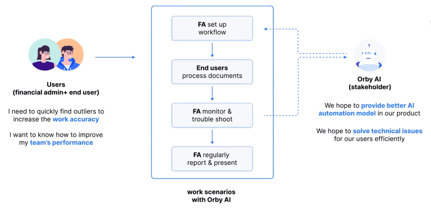

Complex Domain Knowledge in Document AI &. Financial Team Workflow
As new to this type of SaaS product, I need to quickly fill gaps in my expertise.
To address this, I conducted competitive research on similar competitors studying the dashboards of these similar products, summarizing how they visualize key information, provide alert system, and offer insights.


01
Alert System
A great dashboard design blends explanations and exploration, with alerts and insights to help users make smart decisions at work.
02
Key Metrics Summary
Summarizing metrics helps users quickly understand what to monitor without getting overwhelmed by excessive data.
03
Data Visualization
The design should be simple and efficient, using effective data visuals for easy information access and user interaction.
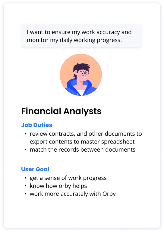
Meet Main Users
The two primary personas have distinct perspectives when analyzing data, allowing them to enhance their decision-making capabilities in their respective work routines.


User Goal &. Key Metrics
We have identified a comprehensive list of metrics that cater to the user goals of two main types of users, allowing them to gain valuable insights into the performance of the Document AI system. These insights enable informed decision-making, workflow optimization, and ultimately lead to higher productivity and success in their daily work routines.


Design Iteration
Overview: More efficient dashboard structure by eliminating navigation bar
In the first iteration, we abandon the initial concept of a navigation tab design in order to limit redirection and reduce development difficulty.
SIMPLIFIED
BEFORE


01
Iteration 01: Simplify Key Metrics
Get info at a glance
Show less but needed enough data to reduce cognitive load
Limit use of graphic to reduce the difficulty in development
BEFORE


AFTER


02
Iteration 02: Term Accuracy
To assist users in narrowing down specific term outliers, the identified conditions are :
When accuracy changes dramatically OR when the accuracy rate is extremely low or high.


03
Iteration 03: Term Performance
01
2 separate tables

02
Line Chart + Bar Chart
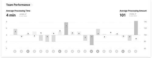

Cons:
Readability issue when cross-checking two charts.
The horizontal axis lacks sufficient scalability to
accommodate a large number of users.
WINNER
03
2 Axis Scatter Chart


Utilize a dual-axis approach to represent two dimensions of performance metrics in a
relative manner.
To maintain chart comprehensibility, associate each point with a team member to
avoid overcrowding.
Highlight the problematic areas.
04
Iteration 04: Alert System


Final Design


Final Design - A Successful Launch

Feature 01
Daily Alert System
USER GOAL 01
Detect and effectively handle any outliers in
the workflow
Increase work accuracy
SOLUTION
Feature panels tailored to the workflow and
provide clear indications of outliers and
actionable insights
Prompt users to take appropriate actions that
improve work quality and productivity
Feature 02
AI Performance Monitoring
System
USER GOAL 02
Monitor AI model performance over time
Identify outliers
SOLUTION
Track term abstracting performance of the AI
model overtime and monitor model output
accuracy
provide insight for potential reasons and help
users diagnose and address issues effectively


Feature 03
Team Performance
Tracking System
USER GOAL 03
Monitor team performance
Identify outliers in the team
SOLUTION
Allow administrators to monitor and track the team performance indicators, such as average task amounts and average time and identify outliers
Check outlier’s task table to further
investigate into the tasks and associated
documents
Reflection


Future Steps
More customized dashboard for different users:


More to explore
Mobile Application Design | Fintech
Ark7 Learn and Reward System
Design end-to-end learning and rewards system to enhance user engagement and order completion rate
Read Case Study
B2C
+53% Order Completion Rate
Web Application Design | SaaS
Orby AI Process Dashboard Redesign
Redesign Saas Process Automation Dashboard to improve operational efficiency and task completion rate
Read Case Study
B2B
Document AI
Carplay Application Design | HMI
JourneyLink V2V Carplay System
A HMI system that forging seamless connections among long-distance multi-vehicle roadtrips
Read Case Study
HMI
80% task success rate
Let's Connect!
Feel free to get in touch with me here ↓
jenniferzeng5562@gmail.com
Crafted with love


by Jennifer Zeng in New York City © 2024
Instagram →

